

Carousel
Shows a set of slides one at a time, with buttons, dots, or swipes to move between them.
Usage
import { Carousel } from '@leverui/components';
<Carousel.Root>
  <Carousel.ItemGroup>
    <Carousel.Item />
  </Carousel.ItemGroup>
  <Carousel.Control>
    <Carousel.AutoplayTrigger>
      <Carousel.AutoplayIndicator />
    </Carousel.AutoplayTrigger>
    <Carousel.PrevTrigger />
    <Carousel.Indicators />
    <Carousel.NextTrigger />
    <Carousel.ProgressText />
  </Carousel.Control>
</Carousel.Root>
Shortcuts
Carousel.Indicators
Renders one indicator per slide. Replaces:
<Carousel.IndicatorGroup>
  <For each={items} keyed={false}>
    {(_, index) => <Carousel.Indicator index={index} />}
  </For>
</Carousel.IndicatorGroup>
With:
<Carousel.Indicators />
Examples
Controlled
Use the page and onPageChange props to programatically control the active carousel page.
Store
Alternatively, use the useCarousel hook to create a carousel store and pass it to the Carousel.RootProvider component for full programmatic control.
Arrows
Use the Carousel.PrevTrigger and Carousel.NextTrigger components to create arrows that navigate between slides.
Indicators
Use the Carousel.Indicators component to render visual indicators that help users track the progress of the carousel and jump to specific slides.
Thumbnail Indicators
Here's an example that uses an image thumbnail as a custom indicator.





Spacing
Use the spacing prop to control the spacing between slides.
Variable Size
Use the autoSize prop to allow variable width/height slide items.
Vertical
Use the orientation prop to vertical to transform your carousel into a vertical slider.
Mouse Drag
Use the allowMouseDrag prop to enable mouse dragging on the carousel.
Autoplay
Pass the autoPlay prop to the Carousel.Root component to make the carousel automatically move between slides.
Lightbox
Compose the Carousel component with the Dialog component to create a lightbox.
Image Carousel
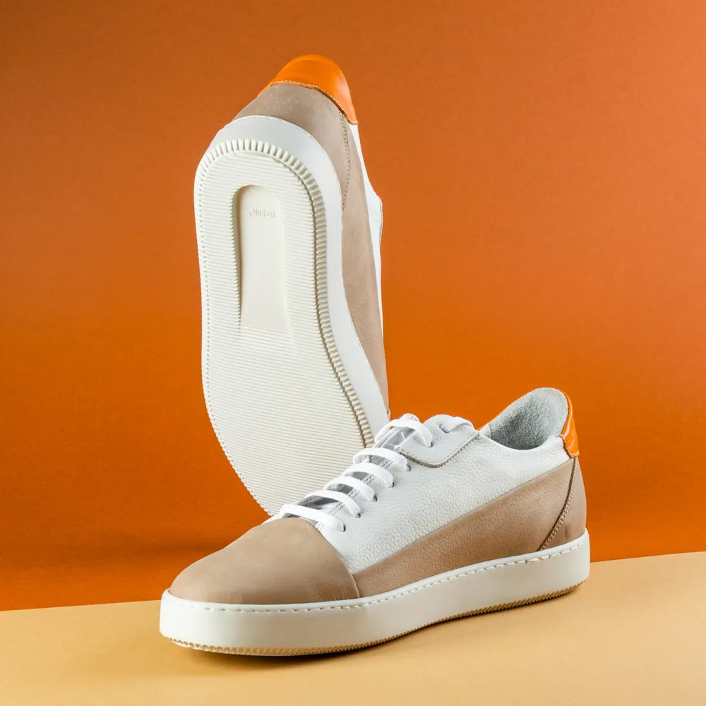
Here's an example that shows how to create an image carousel for a product showcase.





Property Card
Here's an example that shows how to compose the Carousel component with other components to create a property card carousel.








Props
Root
| Prop | Default | Type | Description |
|---|---|---|---|
count | required | number | Total number of slides. |
inViewThreshold | 0.6 | number | number[] | Visible share of a slide that counts as in view. |
orientation | horizontal | 'horizontal' | 'vertical' | Scroll direction. |
slidesPerMove | auto | number | 'auto' | Slides to scroll at a time. |
slidesPerPage | 1 | number | Slides shown at a time. |
snapType | mandatory | 'proximity' | 'mandatory' | How strictly scrolling snaps to a slide. |
spacing | 1rem | string | Space between slides. |
as | div | Native HTML tag | HTML tag to render. |
asChild | — | Solid render function | Render your own element with the part's props. |
unstyled | false | boolean | Turn off the Lever UI styles. |
allowMouseDrag | false | boolean | Scroll by dragging with a mouse. |
autoPlay | false | boolean | { delay: number } | Advance on its own. Default delay: 4000ms. |
autoSize | false | boolean | Let slides have different widths. |
defaultPage | 0 | number | Starting page. |
ids | — | Element ID map | Your own ids, in place of the generated ones. |
loop | false | boolean | Wrap from the last slide to the first, and back. |
onAutoplayStatusChange | — | (details) => void | Called when the autoplay status changes. |
onDragStatusChange | — | (details) => void | Called when the drag status changes. |
onPageChange | — | (details) => void | Called when the page changes. |
padding | — | string | Space that keeps neighboring slides partly in view. |
page | — | number | Current page, when you control it. |
translations | — | IntlTranslations | Translated text for the built-in labels. |
ItemGroup
| Prop | Default | Type | Description |
|---|---|---|---|
as | div | Native HTML tag | HTML tag to render. |
asChild | — | Solid render function | Render your own element with the part's props. |
Item
| Prop | Default | Type | Description |
|---|---|---|---|
index | required | number | Position in the list of slides. |
snapAlign | start | 'center' | 'start' | 'end' | Where the item lines up when it snaps. |
as | div | Native HTML tag | HTML tag to render. |
asChild | — | Solid render function | Render your own element with the part's props. |
Control
| Prop | Default | Type | Description |
|---|---|---|---|
as | div | Native HTML tag | HTML tag to render. |
asChild | — | Solid render function | Render your own element with the part's props. |
Give the root an accessible name, such as aria-label. Label each icon-only
trigger too.
Explorer
Click a part name to highlight it in the preview.
Component Anatomy
Hover to highlight, click to select parts